Performance Analytics is part of the Citrix Analytics service offering from Citrix Cloud. This article explains the newest addition to the Analytics platform, Performance Analytics, which just left Technical Preview after Citrix Summit 2020.
Article Contents
- Traditional monitoring aids user UX
- User experience monitoring
- Citrix Performance Analytics
- Accessing Performance Analytics
- Who can use it?
- Data governance
- Dashboards
- Configure on-premises Sites
- User Experience Analytics
- Drilling into the User Experience (UX) – Example
- Searching for users or sessions using Self Service Search
- Infrastructure Analytics
Traditional monitoring aids user UX
User experience (UX) is the most critical success indicator of any system deployment. Any system you offer as a service to your end-users must, at a high level, be highly available, readily available, responsive, and pose no issues.
To describe this in the context of a Citrix deployment, an application I publish to my end-users via Virtual Apps and Desktops must be easily accessible, it must launch quickly, it must perform like a local application install would in terms of how quickly it reacts to user interaction. Finally, it should not crash out, perform slowly at random times, or throw out any system errors that stop end-users from doing their job.
So how does a published application avoid being on the wrong end of any of these scenarios that would result in poor end user experience? Well, there are several different pieces of infrastructure that are accountable:
- Fast datacentre network: low latency, sufficient bandwidth capacity.
- Fast storage: low latency, sufficient I/O capacity.
- Virtualised hosts: sized for peak usage, do not reach capacity limits that could impact user experience.
- These hosts could be running on-premises such as Citrix Hyperspace, Hyper-V, VMware, or in a public cloud such as Azure or AWS.
- Desktops or Session Host servers: sized for peak load, do not suffer from stress during busy periods of the day.
- Fast client network into the datacentre: low latency, sufficient bandwidth capacity whether the connection is internal or external.
This is certainly not the entire list. We could be more specific or talk about the application build etc however I’ve listed some of the important examples.
Due to the various and complex components that contribute to performing Citrix session, organisations seek monitoring solutions that help them avoid reaching such issues like slow network access, high hypervisor hardware utilisation and so on.
This is why amidst the focus on user experience, it is important that monitoring solutions continue to track and alert on any of the components needed to deliver a great user experience.
User experience monitoring
Whilst monitoring products have traditionally kept track of the performance and health of components within your datacentre, software companies that provide purpose-built Citrix monitoring solutions have more recently been developing their products with end user experience top of mind. Rather than just alerting when a server is not responding, or if storage latency is high, etc, solutions are being extended beyond the traditional monitoring, now focusing more on what the actual user experience is based on logon times, latency, desktop response times and so on. All of these measurements form the overall user experience score.
Being able to report on user experience based on received data is very powerful for the customer running a Virtual Apps and Desktops deployment.
Citrix Performance Analytics
Citrix have developed and released their own user experience (UX) reporting analytics platform, Performance Analytics, or Citrix Analytics for Performance, which is hosted in Citrix Cloud.
This solution calculates the user experience for every user accessing applications and/or desktops from your Virtual Apps and Desktops service, or on-premises Virtual Apps and Desktops deployments using a machine learning engine, which quantifies a number of key performance indicators to determine the UX score.
You can aggregate performance metrics from multiple Cloud and on-premises environments into the single Performance Analytics dashboard and drill down into specific user sessions that are facing performance issues to narrow down the factors that are causing it.
Additionally, the solution also tracks the health of VDAs used across your environments and reports the times when VDAs are unavailable due to being unregistered etc or when they are at high load. Having such analytics at hand further helps you avoid performance issues or bottlenecks due to sub-optimal performance or a reduced number of VDAs.
Accessing Performance Analytics
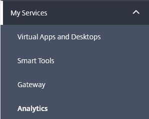
From the Citrix Cloud console, click on My Services -> Analytics.
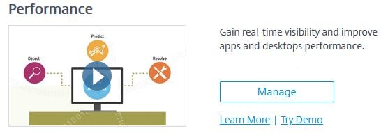
Under Performance, click Manage.
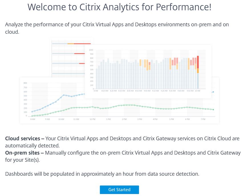
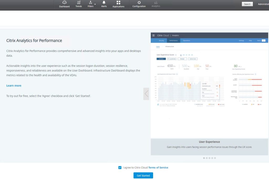
Click Get Started if this is the first time using this service.
Who can use it?
Performance Analytics is available as a subscription, stand-alone offering, or bundled with Analytics for Security.
Customers who run Virtual Apps and Desktops on-premises, in Citrix Cloud, or a mixture can sign up for Performance Analytics.
For on-premises customers that also have a Gateway on-premises, they must onboard the Gateway to get access to network related information in Performance Analytics. They must also onboard their Virtual Apps and Desktops Site.
Data governance
What data is collected and retained by cloud service providers is of high importance to customers. To understand what Citrix collect to provide to you the Citrix Analytics for Performance service, see here: https://docs.citrix.com/en-us/performance-analytics/data-governance.html
Performance Analytics gets its data from the Monitoring database you are familiar with when setting up Director. That data is either stored in your on-premises Monitoring database or or Citrix Cloud, for those Virtual Apps and Desktops service deployments.
For on-premises data, HTTPS/443 is used to push the data from Director to Citrix Cloud. There is no data going from Citrix Cloud to your on-premises environment.
Asides Monitoring data extraction from Director, Performance Analytics also consumes information from Citrix Gateway.
Dashboards
The Performance Analytics solution is split into two sections that are viewed as separate dashboards, Users and Infrastructure.
What you will notice throughout both dashboards is that data is collected from all of the Sites you have connected to Performance Analytics. If you wish, you can filter at the top of each dashboard, so that data is displayed only from a specific Site.
Users dashboard
The Users dashboard gives you a clear, high-level view of the different types of experience being received by your end-users. The first thing you will notice is the User Experience (UX) scores. These scores are made up of indicators such as session responsiveness, logon duration time, session failures, session reconnects and so on. You can view the experience indicators over 2 hours, 1 day, 1 week, etc and you are able to drill into them for further information which can be helpful when troubleshooting.
The UX score is calculated from different metrics measures from a user’s initial session launch until its end. Those calculated metrics that make up the UX score are:
The UX score is categorised into Excellent, Fair, or Poor groupings, allowing you to easily see which of your subscribers are not receiving an acceptable experience.
Infrastructure dashboard
The Infrastructure dashboard provides insights into the health and performance of your VDA machines across your Sites.
As you view the main dashboard, you can see the number of desktops across your site that may be in an unregistered state, failed state, or be under high load, etc.
The Infrastructure dashboard compliments the User Experience dashboard, as if there are performance issues with VDAs, or VDAs are in an unavailable state, end-users could ultimately face performance degradation or compete for a lesser amount of available resources.
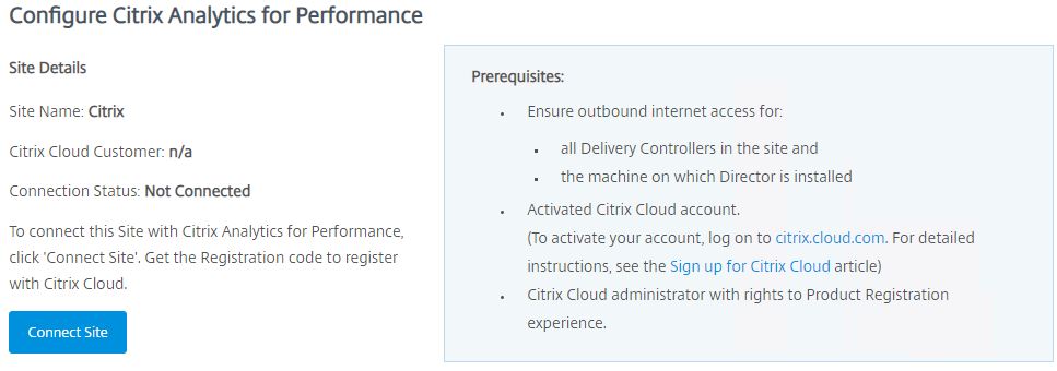
Configure on-premises Sites
Unlike Virtual Apps and Desktops service Sites, on-premises Sites need to be manually connected to Performance Analytics.
Requirements
- Director 1909 or newer.
- Delivery Controllers 1909 or newer.
- Director and Delivery Controller servers must be able to reach the following sites:
- Citrix Key Registration: https://*.citrixnetworkapi.net/
- Citrix Cloud: https://*.citrixworkspaceapi.net/
- Citrix Analytics: https://*.cloud.com/
- Microsoft Azure: https://*.windows.net/
- A Citrix Cloud account with full Citrix Cloud Administrator permissions.
- A user account with administrator permissions to Director.
Proxy requirements
- If your Director and Delivery Controller servers use a proxy, the useDefaultWebProxy field must be set to true in the following configuration files:
- Director: web.config under C:\inetpub\wwwroot\Director\
- Delivery Controllers: Citrix.Monitor.exe.Config under C:\Program Files\Citrix\Monitor\Service\
- The proxy server must whitelist the addresses listed under the Requirements section.
Configure on-premises Site with Director
To connect your on-premises Site to Performance Analytics, you use the Director console on-premises. After that, data takes around one hour to filter through to Performance Analytics.
Perform the following steps on one Director server connected to your on-premises Site. Other Director servers will update at the next refresh.
From the Director console, click on the Analytics tab.
Click on Connect Site.
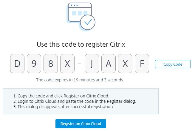
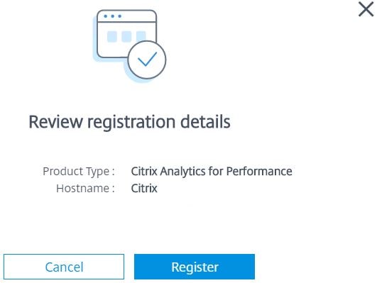
Take note of the code you will need to register on Citrix Cloud. The Copy Code button can be used to copy the code to your clipboard. Click on the Register on Citrix Cloud button to be directed to Citrix Cloud.
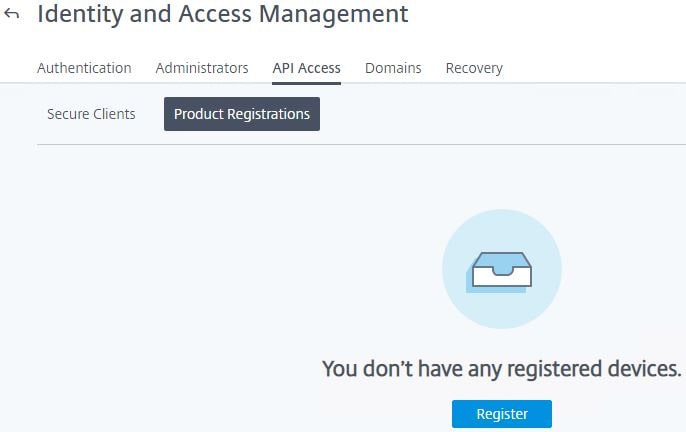
Navigate to Identity and Access Management -> API Access -> Product Registrations -> Register.
Enter the code you received from Director and then click Continue.
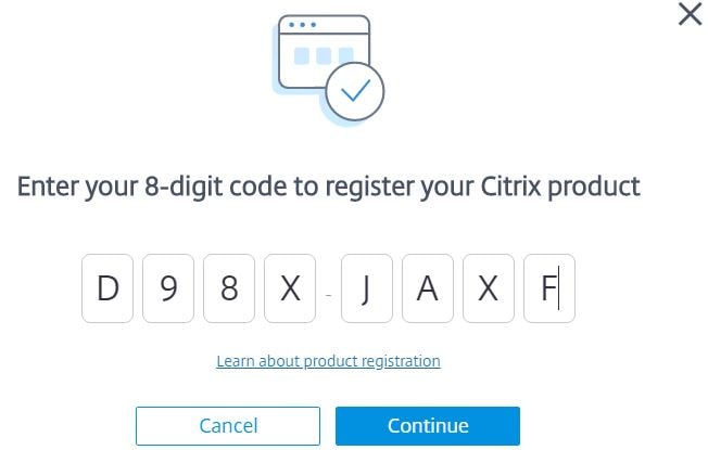
Click Register.
Click Close.
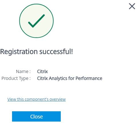
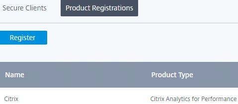
Your on-premises Site will appear as registered with Citrix Analytics for Performance.
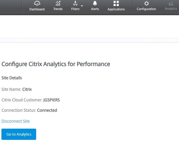
The Analytics tab of Director will also show you are connected to the Performance Analytics service.
If you have other on-premises Sites, perform the same steps for each.
Configure on-premises Citrix Gateway
To obtain network related statistics from your on-premises environment, you must configure your on-premises Gateway with ADM service in Citrix Cloud. Gateway 12.1 and later are supported.
- Register your on-premises Gateway with ADM service.
- Configure HDX Insights on Citrix Gateway.
- Enable Advanced analytics.
User Experience Analytics
User Experience Analytics, via a unified dashboard, gives you insight into the different types of experience being received by your end-users when they access resources from your Sites. All of your Sites, whether Cloud or on-premises, are aggregated into this single pane of glass.
Key performance metrics, or factors, that are: Session Responsiveness, Session Logon Duration, Session Availability and Session Resiliency are baselined using dynamic thresholds that then help measure the User Experience (UX) score, which is categorised into Excellent, Fair, or Poor categories. The UX score, marked from 1-100, is assigned to users connecting to sessions hosted from these Sites monitored by Performance Analytics.
- Excellent UX – Users with a UX score between 71-100. Users had a consistently good experience across all factors.
- Fair UX – Users with a UX score between 41-70. Users had a degraded experience for a limited period of time across certain factors.
- Poor UX – Users with a UX score between 1-40. Users had a prolonged degradation across several indicators.
Key performance factors are then further divided into subfactors. For example, Session Logon Duration is made up of Brokering, Authentication, Profile Load, GPO time etc.
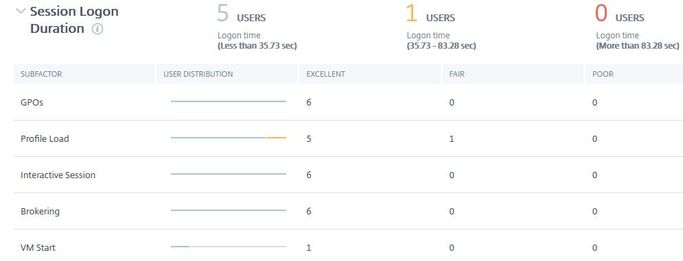
Dynamic thresholds for each key factor are calculated for each customer based on the metrics collected during the past 30 days. As an example, I’ve recorded the thresholds for each performance metric in my deployment below to give you an idea of how my Session Experience scores will be categorised and fed into the overall User Experience score. Each customer will have different thresholds. These key performance factors listed below are measured the moment a user attempts to launch a session, until the end of that session.
- Session Logon Duration – How long it takes for a session to launch, and for the logon to complete.
- Logon time below 35.73 sec -> Excellent.
- Logon time 35.73-83.28 sec -> Fair.
- Logon time above 83.28 sec -> Poor.
- Session Responsiveness – The in-session responsiveness or session latency.
- RTT below 188 ms -> Excellent.
- RTT 188-300ms -> Fair.
- RTT above 300ms -> Poor.
- Session Availability – The success rate of establishing a session when attempted by the end-user, versus failure rate.
- Failure rate below 10% -> Excellent.
- Failure rate 10-20% -> Fair.
- Failure rate above 20% -> Poor.
- Session Resiliency – How often Workspace app recovers from network failures when the user is connected over a sluggish network. Also known as session reconnection, when the user loses network connection, but the application remains on the screen until the network connection is restored.
- Average reconnect rate below 1 per 15 mins -> Excellent.
- Average reconnect rate 1 per 15 mins -> Fair.
- Average reconnect rate above 1 per 15 mins -> Poor.
Each key performance factor listed above is calculated to form the overall User Experience (UX) score, viewable from the Users dashboard amongst other places. It is also important to note that some of the performance factors carry more weight than others. For example, Session Resiliency has more impact in regard to UX scoring than Session Logon Duration. Each performance factor has a weight applied, Session Availability holds the highest weight.
Using the UX categories on the main dashboard allows you to focus your attention on the users who actually need some help improving their experience. You can drill down into the User Experience categories (Excellent, Fair, Poor), individual performance factors (Session Availability, Session Resiliency, Session Responsiveness, Session Logon Duration), or individual users, via Self-service Search etc.
Overview of Users Dashboard
User Experience (UX)
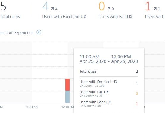
On the main Users dashboard, you can view the User Experience (UX) score categories previously mentioned. From as little as 2 hours, to as far back as one month. You can also see the Total users over the selected time period, and how many users have had an Excellent, Fair, or Poor user experience. I can view this data across all of my Sites or select specific Sites.
The user experience classifications for all users over the time period selected display in a colour-coded graph, making it easy to trend and identify certain times of the day where users may have experienced less than desirable performance.
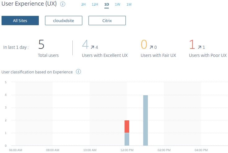
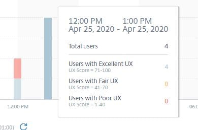
You can hover over the colour-coded bars, which displays a tooltip containing information on how many users connected during that time, and how many users made up each of the UX score categories.
The arrows against each category, as shown in the below screenshot, indicate the trend in number of users versus the previous time period. For example, over the past day out of 5 total users, 4 users have had an Excellent UX, which is also 4 more users than the previous day.

User Sessions
Scrolling down the main Users page you next come across the User Sessions section, which displays over chosen periods of time the total sessions, total unique users, and session failures from either all your Sites, or specific Sites.
In this example, across all my Sites, 13 total sessions were launched during the last day from 6 unique users. During this time, 4 session failures occurred which can be clicked in to.
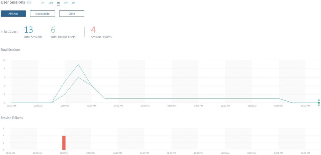
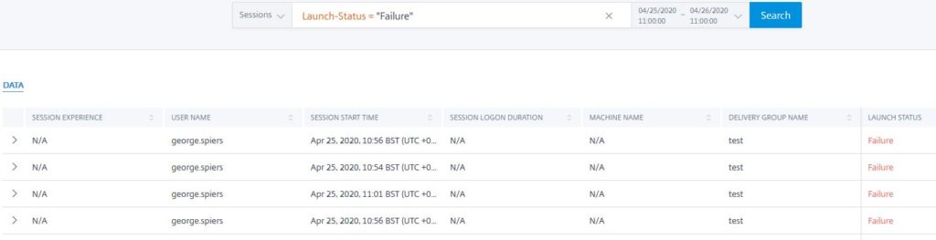
Clicking into the Session Failures brings me direct to a custom Session based self-service search, showing over the past day Launch-Status = “Failure”. Here I can see a user with session failures against a Delivery Group named test. Data can be exported to CSV if desired.
User Sessions – Example Use Case
Knowing how many Active Users have connected to your Site over the past day, week, or month, allows you to license your Site(s) appropriately now, and in the future. You will be able to identify usage trends ahead of time, allowing you to make proactive decisions.
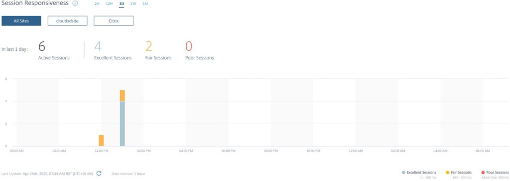
Session Responsiveness
The next section you come across in the Users dashboard is Session Responsiveness, which displays over select periods of time the ICA RTT calculated from each active session across all Sites. Individual Sites can also be selected to view this data.
The RTT is the time it takes for user input to reach the VDA, and the response to appear on the end user’s endpoint, perceived as session lag.
There are Session Responsiveness threshold indicators to the bottom right of the graph, so you know how Excellent, Fair and Poor sessions are calculated etc based on RTT. Remember that performance metrics are calculated using dynamic thresholds, so each customer will have different category score ranges.
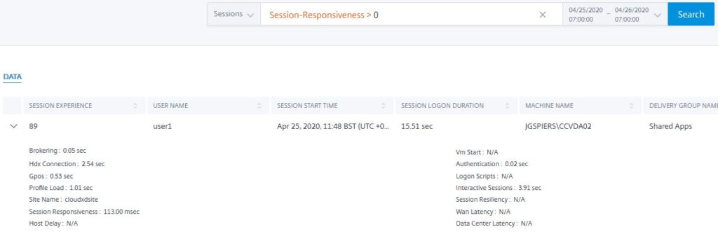
If I want to get more information on Fair sessions, I can click the overall number, or click into the coloured bar chart above a time of my choice.
Clicking into the Fair sessions drills down to a custom search view, showing the sessions that had slightly high Session Responsiveness. Each session can be drilled into using the arrows to display that actual RTT, in this example, 113 msec, amongst other information such as the logon time, user name, VDA connected to and so on.
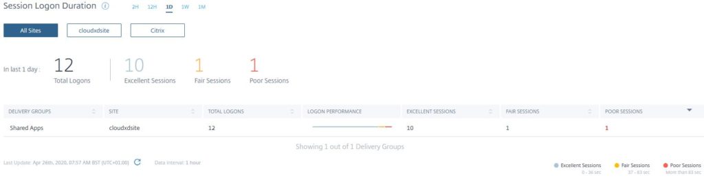
Session Logon Duration
Scrolling down the main Users dashboard you next come across the final section, Session Logon Duration, which displays over select periods of time how many users logged on to your Sites, and what category those logon durations fell into. You can select to view logon duration data across all Sites or specific Sites.
There are Session Logon Duration threshold indicators to the bottom right of the graph, so you can easily see how a Fair session is calculated etc based on logon duration. Remember that performance metrics are calculated using dynamic thresholds, so each customer will have different category score ranges.
The Logon Duration is calculated by measuring phases of the logon process such as Brokering, VM Start, Authentication, Profile Load, GPO and so on, until the application or desktop is ready to be used.
Each Excellent, Fair and Poor category is clickable.
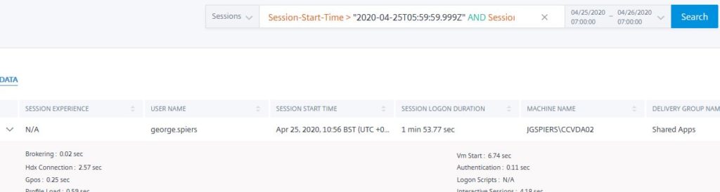
Clicking into a category shows a custom Sessions based self-service search view, and displays the sessions applicable, including logon duration, user name, VDA connected to and so on.
Drilling into the User Experience (UX) – Example
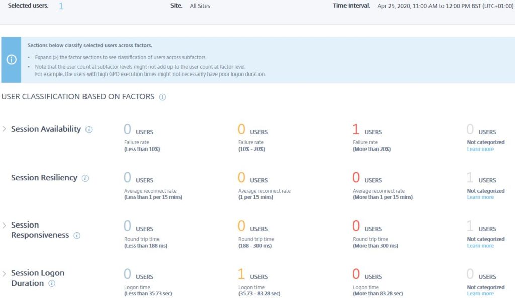
If you want to see who received a Poor UX for example during a specific period of time, under the User Experience (UX) section of Performance Analytics -> Users, hover over the bar chart and click on the Poor UX, red colour coded bar on a time of your choice.
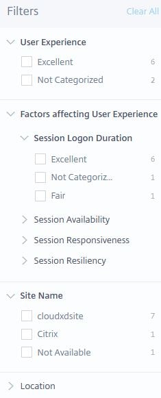
This brings you to the User Experience (UX) Factors page, which shows which performance metric factors caused the poor user experience for all users during that time. In my example, only one user had a poor experience during 11am to 12pm. Each factor can be drilled into to see subfactor specific metrics that make up the score for that key factor, which can help determine if there are any subfactors that continue to impact users and the user experience.
For example, if I expanded Session Logon Duration I could see if it was GPO processing time, Profile Load time, Interactive Session time, or Brokering time etc that caused Session Logon Duration to be categorised as Fair for this user session, or all user sessions during that time period.
Drilling into the subfactors allows us to see specifically what caused poor user experience.
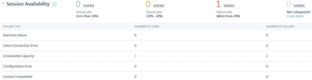
Expanding the Session Availability factor, I can see that this user triggered the subfactor metric Unavailable Capacity four times. It is likely that this user was trying to launch an application but there were no available VDAs or trying to launch a desktop that was switched off. Now that we know the subfactor which caused the Poor experience, we can click on the 1 Users text to see the user affected.
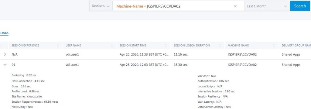
Performance Analytics drills further into our available data, and we now see the user affected. Using the arrow, we can expand the box to see some more performance related data for this user between the hours of 11am to 12pm, which can be changed.
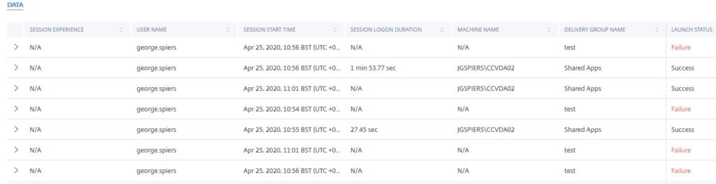
Here we can see that out of 7 launch attempts, 4 failed, which would certainly classify this user as receiving a poor experience. Clicking on the user’s name under the USER NAME field gives more information specific to each session.
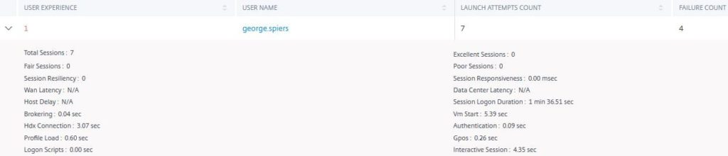
We now know that connection failures have been occurring against a single Delivery Group named test. It would appear that VDAs in that group are not available. Connections have been successful against the Shared Apps Delivery Group. These numbers, 7 failed 3 successful, is also what we learned from the previous screen.
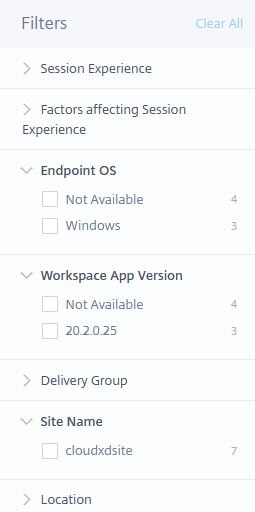
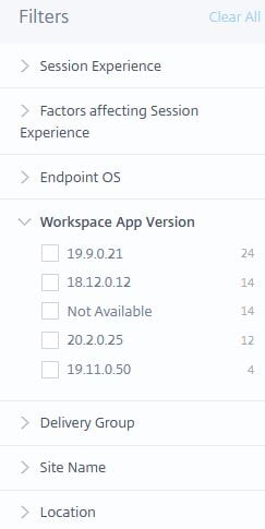
A Filters pane appears to the left of the screen which, if anything under these circumstances, allows you to see which Site the connections were made against, Endpoint OS and Workspace app version used etc. You can filter on these metrics to really get specific on what data you want to see.
Not categorized
When viewing performance factors and subfactors, you may see at times that they cannot be categorised. This can happen due to general system errors, or:
- A session fails to establish, causing factors and subfactors to not be measured.
- Session Responsiveness subfactor metrics cannot be measured unless a user is connecting through Citrix Gateway 12.1 or later, which has been configured with Performance Analytics.
- Certain Session Logon Duration subfactor metrics cannot be measured for certain reasons. For example, VM Start cannot be measured for non-power managed machines, and Logon Scripts are not measured if you do not have any configured for the session.
User Experience (UX) – Example Use Case
By drilling into the User Experience (UX) factors, over the period of one month for example, I can see out of all my users which subfactor of the Session Logon Duration was scored Fair or Poor the most.
For example, maybe the Profile Load subfactor is continuously scored as Poor for my users. This data gives me something to focus on, for improvement purposes.
As another example, I can drilldown into the subfactors of Session Responsiveness, which will show me out of my users how many had poor Data Center Latency, WAN Latency, or Host Delay. A high poor Data Center Latency count may indicate a problem between Citrix Gateway and the VDAs, for example something in the server-side network.
Remember that to view the subfactors of Session Responsiveness, you need to configure Citrix Gateway 12.1 or higher with Performance Analytics.
None of the subfactor metrics account for packet loss, out of order packets, duplicate acknowledgments, or retransmissions. Latency may increase in these cases.
Searching for users or sessions using Self Service Search
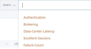
Users
Performance Analytics has a powerful self-service search function that can be used to either search for users, or sessions, under a number of conditions. This can be useful if you receive reports from particular users that their session performance is poor, or you are investigating issues with a particular Delivery Group, VDA, etc.
To the top right of the console, click on the Search button.

Using the drop-down box provided, under Performance, select either Users or Sessions.
For Users, I can click into the whitespace which presents a number of conditions I can search on.
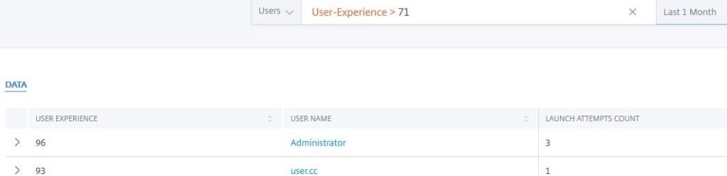
An example search could be to find users that have had a user experience greater than 71, meaning an excellent user experience.
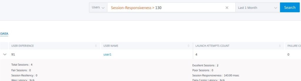
Another search example could be to find users over the last month who have had more than 130 msec of ICA RTT latency.
Other search examples could be to find users who have had over 30 seconds of GPO processing time during the logon, or over 5 seconds of Brokering time.
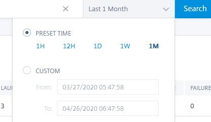
You can adjust the time from a month right down to within minutes of a particular day.
The Filters box to the left of the Users search allows you to filter viewable data by User Experience, Site, Location, and User Experience Factors. Allowing you to finely tune the data you are looking for.
All data is exportable to CSV format.
Sessions
For Sessions, I can for example look up all sessions for a particular time period that have been launched against a specific machine. I can see the launch status, user connected, performance metrics for each session and so on.
Again, sessions to your filtered search conditions can be displayed from a month down to minutes of a particular day.
You also have the Filter box available to the left, which can be used to refine the data you see. You can filter on Workspace app version, Endpoint OS version, Session Experience, User Experience Factors, Delivery Group, Site Name and Location.
Infrastructure Analytics
Infrastructure Analytics, via a unified dashboard, gives you insight into the health and performance of the VDA machines across your Sites, whether Cloud or on-premises, aggregated into a single pane of glass.
Infrastructure Analytics gives you the number of VDAs across your Sites and more specifically Delivery Groups. How many of those VDAs are usable, or unusable due to being unregistered or in a failed state, how may have Low, Medium, or High Load, and how may are in Maintenance Mode.
This data compliments the User Experience scores. For example, as previously mentioned, Session Failures is an indicator that will affect the UX score. If you are finding a lot of users experiencing session failures, Infrastructure Analytics will help you to determine why that is. It could be due to VDAs being in Maintenance Mode, resulting in a limited amount available that are under peak hours stressed and reporting high load. It could also be because a number of VDAs are in a failed or unregistered state and therefore unavailable for end-user sessions.
Infrastructure Analytics also allows you to see how your VDAs are being used across your Sites. Do you need to scale up, can you afford to scale down, are you having too many occurences of VDAs failing that needs to be addressed, and so on.
Overview of Infrastructure Dashboard
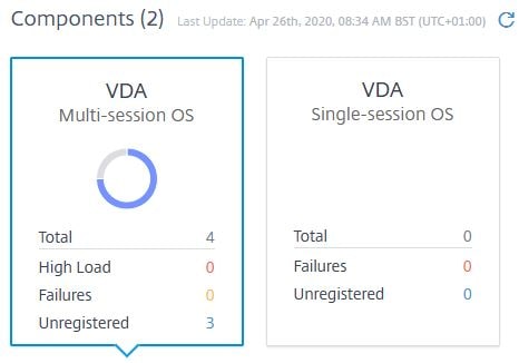
Components
On the main Infrastructure dashboard, the Components section shows Multi-session OS and Single-session OS widgets that display the number of VDAs across your Sites, and whether they are under High Load, Failed or Unregistered. These widgets are very beneficial for getting a quick view of the state of the presentation layer across your Sites.
Clicking on either widget forms the data that will displayed further down the dashboard. In my environment, I only have multi-session OS VDAs. Also, because this is a test environment, I only have a couple of VDAs, so example data will not reflect as well as what production data would do.
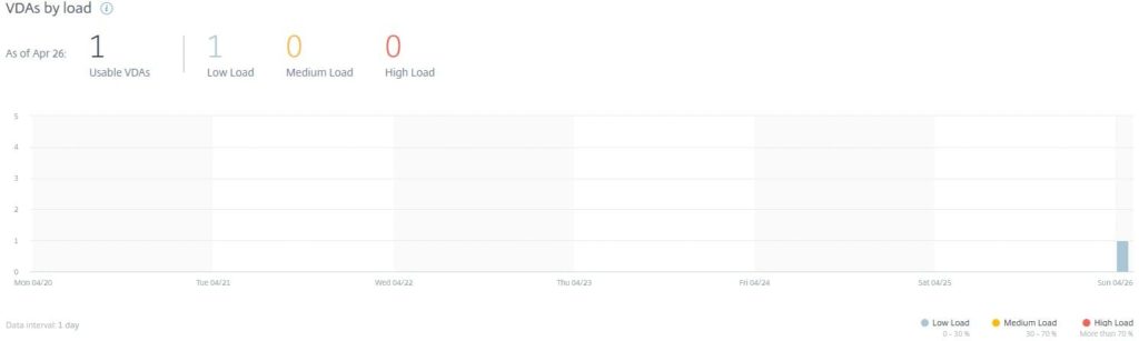
VDAs by load
The VDAs by load section is only available for multi-session OS VDAs. Here you can view over selected periods of time the total amount of VDAs usable, and which ones are under Low, Medium or High Load.
By hovering over the graph, you can see the load statistics in more detail for each period of time.
There are load threshold indicators to the bottom right of the graph, so you can easily see how a desktop is classed as having a Low, Medium, or High load.
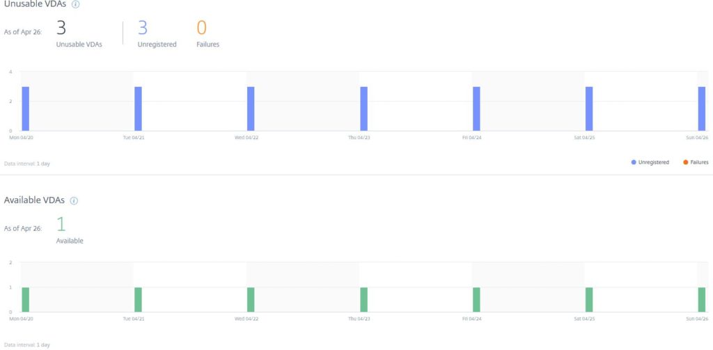
Unusable & Available VDAs
This section covers quite simply the Unusable VDAs calculated over the selected period of time, versus the Available VDAs.
A VDA may be unusable if powered off, is not registered with a Delivery Controller, is experiencing internal issues, or is encountering network issues etc.
By hovering over the graph, you can see Unusable and Available VDAs statistics in more detail for each period of time.
Note that Available VDAs only applied to multi-session OS VDAs.
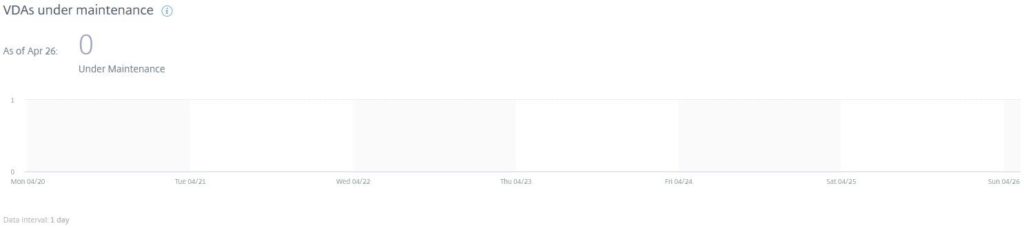
VDAs under maintenance
This section displays if any VDAs were in Maintenance Mode during the selected the time frame.
By hovering over the graph, you can see how many VDAs were in Maintenance during the selected period of time.
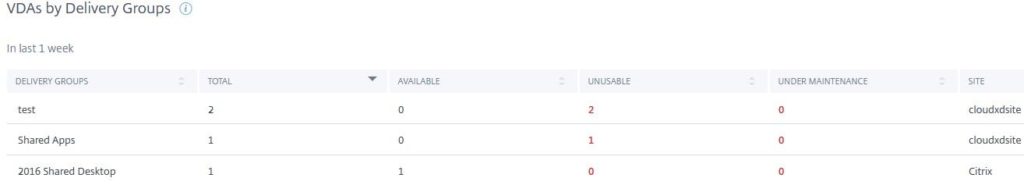
VDAs by Delivery Groups
The final section of the Infrastructure dashboard provides you with an overview of each Delivery Group in your Sites (or Site if you select a specific Site at the top of the dashboard). Also, how many VDAs are in each Delivery Group, how many are Available, Unusable, or Under Maintenance, as well as the Site in which the Delivery Group comes from, which displays if you select to view All Sites.
Pingback: Citrix Analytics for Performance | eG Innovations